Related Collections from the Archive
Related content
As the German publisher Gerhard Steidl prepares a series of books on the life work of David Goldblatt, Jeffrey Ladd spoke with the South African photographer about the newly edited and designed release of his long out-of-print collaboration with Nadine Gordimer from 1973, On the Mines.
Jeffrey Ladd: Alongside the political and economic realities of mining Gold or other natural resources there can be any number of powerful metaphors associated with “mining.” For example: what is “on the surface” and “what is hidden”; social strata within the apartheid system; light and darkness; heaven and hell—what initially drew you working on a project about the mines?
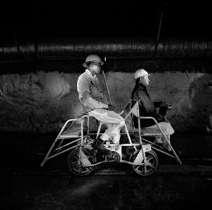
 The cover of On the Mines by David Goldblatt, published by Steidl.
David Goldblatt: I was drawn to photograph the mines not by any metaphor in which they might be seen but by their overwhelming presence in the life and landscape into which I grew. Photography offered both the justification and the medium for greatly extending experience and understandings begun in childhood.
JL: One of your earliest images, from 1947, is linked to mining. It shows an area called The Millsite dump purported by the local population to be the largest tailings dump in the world. You roamed this area and the mining estates as a child.
DG: As White children growing up in Randfontein my friends and I enjoyed almost unfettered freedom to roam among the mines that curved around our town. There were two provisions: never enter the fenced off areas that carried the skull and crossbones and the warning, 'Caving Grounds'; and not to play on the slimes dams, formed by the mud that came from the mills. But we did play on the sand dumps, especially one called Whitey because of its fine white sand.
There was blind innocence to our meanderings on the mining estates. We took care to avoid the Pondo miners—our myth had been that they were ‘dangerous.’ We didn’t know their language, we didn’t know anyone who had been harmed by Pondos, but we feared them. We never wondered about the lives of the Black miners, living 40 to a room and far from their families.
JL: As a photographer were you able to see firsthand how the mineworkers lived in their compounds and hostels?
DG: Permission had been given to me by the ‘head office’ to take photographs in the hostel of the Western Deep Levels mines in Carletonville. Without consulting me the hostel manager sent out an instruction that men of each tribal group were to present themselves to me in tribal dress. I had no desire to do ethnographic “studies” and was preparing to withdraw. But then I saw the men and that they took the occasion very seriously and with great dignity. And so I photographed several groups.
JL: The book begins with a few photographs shot in color that date from the mid-to-late 60s, you turned to working primarily in color much later in your career, were these among the earliest of your color images? Was there a moment in working that you decided to use color?
DG: Professionally I worked in color on commissions since 1964. The color photographs in the new edition were made experimentally rather than from conviction that that was the ‘right’ medium for the subject. In addition, in the late 60s and in the 70s and 80s I did quite a lot of color photography underground for mining companies but I did not bring this into what I regard as my personal work.
JL: How were you able to gain, what appears to be, unrestricted access to the mining estates to photograph?
DG: Access to mining properties was quite severely restricted. If I was roaming on an estate that had ceased operations many years before, a mine policeman might appear suddenly as though from the earth to challenge me. Sometimes I would be allowed to proceed, sometimes not. On some properties I approached senior management first and was given permission to photograph. Photography in the compounds/hostels and underground would have been impossible without such permission.
JL: The 1973 edition of On the Mines is strikingly different from this second edition. You have redesigned, added 31 photographs and removed 11.
 David Goldblatt
DG: The design of the original lacked wholeness and indulged in visual excesses in which I no longer believe. The first chapter (The Witwatersrand), was strongly graphic and contrasty, with some of the pictures going across the gutter; the second (Shaftsinking), was blighted by an ill-conceived attempt at drama, dropping the pictures into a black surround; the third (Mining Men), was classical one-picture-to-a-spread. In the new edition I wanted to give greater coherence and unity to the whole, and while not attempting to provide contemporary photographs, I wanted to enrich the mixture with many more photographs from the original archive. I invited Cyn van Houten, a designer with whom I had worked on magazines in South Africa and who had designed three other books for me, to design this one. We have a good understanding of each other’s thinking and so it became a real pleasure to put this book together.
JL: I recall you telling me that Sam Haskins offered advice with the design for a couple of your early books, did he help also with the 1973 edition of On the Mines?
DG: Sam’s influence is strongly evident in the first chapter of the first edition—bold, graphic, contrasty, but as far as I can recall, he was not involved with the design. Sam was remarkably generous to me. At a time when I knew nothing about using photographs in a book, he designed a dummy for my first essay, Some Afrikaners Photographed. In the end, I adopted a completely different approach from his, but in the process I learned a great deal about book design. The design of the first edition of On the Mines marked a sort of hybrid point in my understanding, where the first chapter is heavily indebted to Sam’s thinking and the last one, my departure from there.
JL: As Steidl publishes other volumes of your life’s work, will they all be completely revised and newly designed?
DG: I can’t say at this stage how we will approach subsequent books. I would hope to come to each on its merits. For me the particular attraction of a new edition is the opportunity to correct errors and to strengthen what was done originally.